In a recent article Creative Review magazine discussed the development of the site ‘Logobook’; a compendium attempting to display all logos dating back to the 1950s. The various filters through which one may explore this library allow for specific collections like 3D or ‘fire’ emblems to be viewed, which ultimately led me to the section on the letter J. As this blog ages a logo or specific typeface seems like an upward progression towards professionalism, and as such I would like to share my experience window shopping through ‘Logobook’ and garnering some kind of idea how to approach creating my own logo, should that time come.
The letter J itself was not recognized independently until Middle High German between 1050-1350 A.D, contrary to the prominence of historical names like Julius Caesar or Jesus – which have been modernized through transliteration. This was always annoying whenever I wanted to write my name in the Ancient Greek or hieroglyphic alphabet when I was young, instead having to exchange the ‘J’s for ‘I’s.
The creativity and variety in the Logos extrapolated from this single letter exhibit a real breadth of technique and style. The symmetrical branding for 60s advertising company Jorge R initially caught my eye because it  is also my initials, the old print stencil style seems very formal nowadays but uses space and contrast in a very clean and artistic manner. The technique reminds me of a collection of posters by Anthony Burrill that I own called ‘I like it, what is it?’, in which his experimentation with print press typography is detailed.
I believe the most intricately and brilliantly constructed logo using the letter J to be the Huel and Pelletier for Jeunesses Musicales du Canada, in Montreal. Merging the J, M and C to ingeniously create a brass instrument , whilst retaining the shape of the individual letters themselves. Huel’s portfolio is certainly one to behold, he brings a level of artistry to logo design and has a range of creations to his name within the database of ‘Logobook’. However, the J in this logo occupies more background space instead of the forefront of the insignia. For designs that simplistically and boldly use the letter J, look no further than the Hans-Peter Frantz design for umbrella company Jochan Regnschirme – which goes back to basics making obvious use of the similarity in shapes between an umbrella and the letter itself.
From the glaringly facile to the daringly abstract, the range of ways in which the letter J is presented certainly speaks volumes as to the job of the designer. One can somewhat cop out and construct something basic, like this industrial design company logo – or, conversely, one can go as far as creating a piece of art, as is the case for the Joe Dieter design agency, or the Jerusalem Economic Conference, among many others.
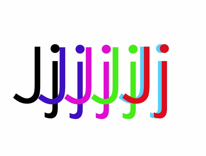
As for my own Logo, I have been experimenting with layers of colour and creating a retro 3D effect using opacity on previous article images. The featured image for this post is a good starting point, and I shall return to it and try accomplish something near to the professionals work that I have lost a fair amount of time just scrolling through on ‘Logobook’.

2 Comments